Understanding how an individual viewer rates the features within your Standard Demo gives you great information on how to follow up and ensure the content you are providing is as relevant as possible, whether on a phone call or within an email. Understanding how all the viewers of your Standard Demo rated the features gives you incredible insight into your Demographic and the main areas of interest within the market. You can find this aggregate view within the Summary Demolytics for your demo.
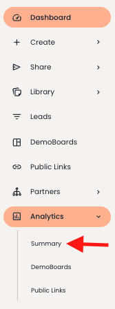
- Navigate to Summary under the Analytics dropdown on the left hand navigation.
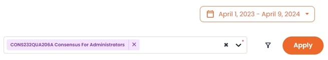
- Within Summary Demolytics, select your Standard Demo. Make sure your date range is set, and then click Apply
- Within the Summary Demolytics page, select the Feature tab
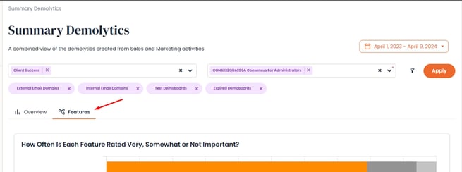
Within this page, you will see the breakdown of how your viewers have rated each feature as Very, Somewhat, or Not Important.
How Often
The first graph will break down how often each feature has been rated as Very, Somewhat, or Not Important. This gives you an easy to digest view into what feature your viewers are seeing as more important, and what features simply are not as important to them. Hovering over each feature will give you the exact percentage breakdown of that features ratings.
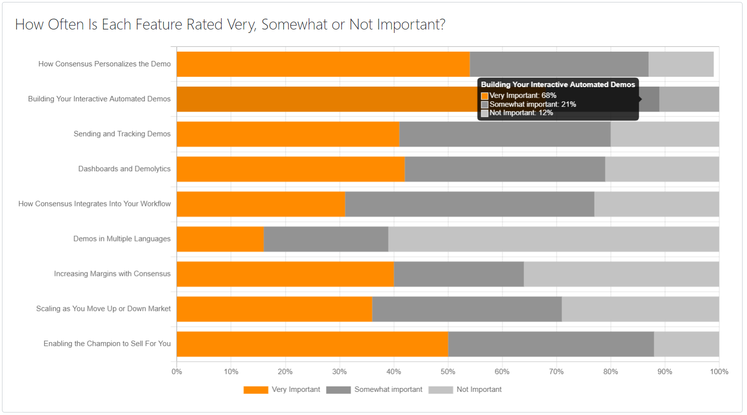
In this example you can see that 'Building Your Interactive Automated Demos' is seen as Very or Somewhat Important 88% of the time while 'Demos in Multiple Languages' is marked the same only 39%. This information can be used to help drive Product Marketing as well as general Sales Outreach focus to know which areas will have the most impact on your recipients.
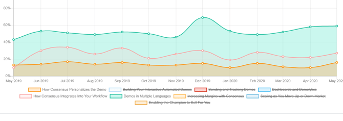
Feature Trending
The Feature Trending graph gives you an idea of how a specific feature is rated over time. This is most enlightening when used over a long period of time and can help give you insight into market trends of your different feature topics. Are these topics becoming more important, or less important on average to your viewer.
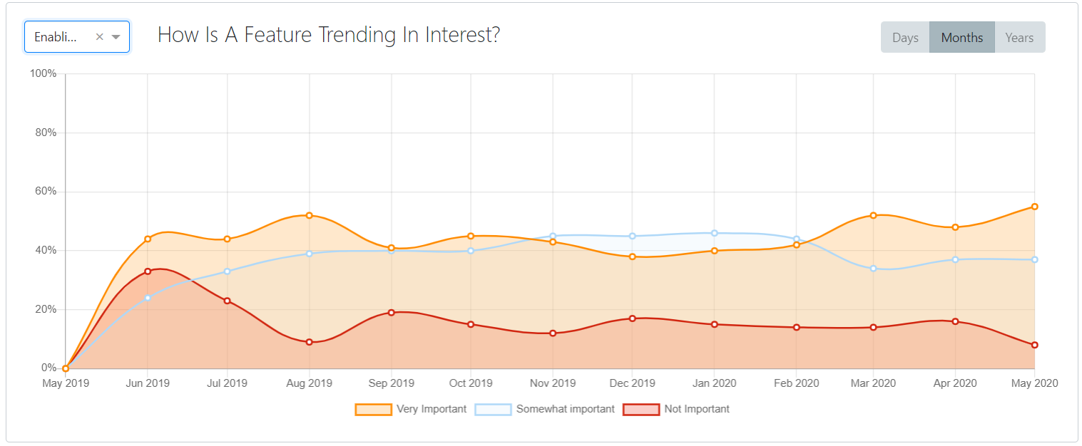
- You can adjust which feature you are looking at in the upper left hand drop-down of the graph.
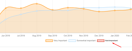
- Click on an importance level to remove it from the graph to get the exact view you want
Feature Comparison
The last graph allows you to compare all of the features within your demo against a specific rating. See how features are marked as Very, Somewhat, or Not Important over time. This allows you to see how features are performing against each other and understand where trends or spikes of ratings occur.
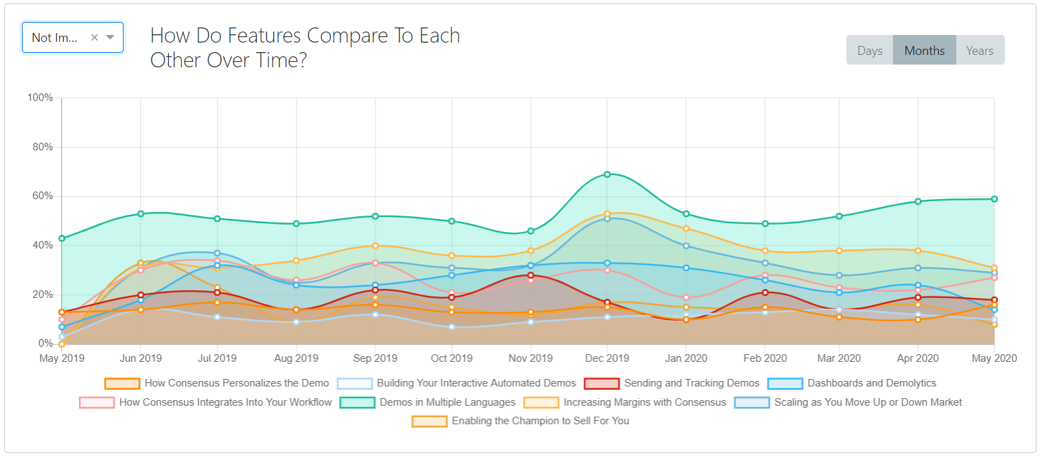
- Change the feature rating level in the upper left hand drop-down of the graph
- Click on specific features to remove them from the graph to get the exact view you want