Consensus doesn’t just provide a cool way for prospects to watch an automated demo, there is also a lot of data that can be gained from our analytics or Demolytics as they are called in Consensus. In this article we want to highlight the Sales Demolytics tab and which areas sales leaders should focus on.
Before we dive in there are some data points you need to understand, besides DemoBoards created, DemBoards viewed, recipients are the number of people added to all of those DemoBoards. You have the view rate is the percent of DemoBoards sent, that have a view. You will want to make sure you understand what a stakeholder is. This is where a prospect has been sent a DemoBoard and they have forwarded it onto someone else. You will now have the information for this new stakeholder and their viewing info for the demo itself. Particularly early in the sales cycle, you should always encourage prospects to share the demo with others, you never know who you will discover. The discovery rate is the percentage of DemoBoard views that came from new stakeholders. Last is the Doc Downloads, this is for demos where you have attached any documents and just a general idea of how many times those documents were clicked on and downloaded.
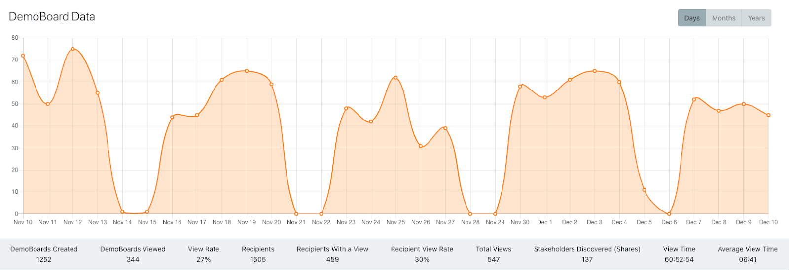
1. The first thing you will want to pay attention to is the main graph on the sales demolytics tab. You will want to view as a whole, how many demoboards are the team sending out. What is the view rate and average view time? As a rule of thumb members of a development team should be sending 75-100 demos every month with a view rate of 10- 25% and closing teams should be sending 20 - 40 per month with a view rate of 30-40%. On this main graph you can filter this data for groups, users, and individual demos, you can also adjust the time frame with this data. Average view time is an important metric as well. Average B2B demo view times are about 60-90 seconds. We typically see about a 2x increase in view time using an automated demo.
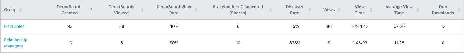
2. Below this you will see this breakdown for each team within Consensus. If you have two teams in similar roles you can see how they stack up against each other. Like the main graph you will be able to see demos sent, views, view rate, stakeholders discovered (a very important piece of data that you will want to focus on), Discovery Rate, and Doc Downloads.
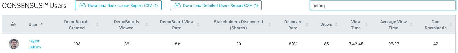
4. Next you will have a view of the demos most recently sent to customers. You will see the company it went to, which individuals were on the demoboard, which demo they were sent, and data on engagement. Keep in mind if it has been 24-48 hours and you haven’t seen any engagement, reach back out to those prospects to encourage them to watch or share the demo. As customers start to view the demos you will see their engagement go up and you will have the opportunity to select that demoboard and see more detailed information on view time and how they ranked the different features in a demo.
5. Finally you will be able to see how each of the unique demos that have been sent out are being viewed. Monitor how often each demo is being sent out and what the view data is like for it. You may discover one demo is being viewed more often and you can dig in on why that is and how you can utilize it more.